A few smart folks have already put together their thoughts on responsive tables and, while I think the proposed methods are pretty good, I think there might be room for improvement. As such, I’ve been tinkering for a while and came up with the following strategy when it comes to tables.
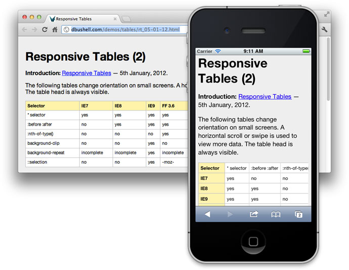
This is designed to turn tables into rows, for easy mobile viewing
JQuery:
/*Mark TDs as empty if they have no text or img*/
$('table td').each(function(){
    if ($(this).text().trim().length < 1 && $(this).find('img').length < 1){
        $(this).addClass('empty-td');
    }
});
/*Add Attribute to each TD in table*/
$('table').each(function () {
    var table = $(this);
    if ($(this).find('th').length > 1) {
        $(this).find('tr').first().children().each(function (index) {
            //console.log($(this).text());
            $(this).addClass('hide-table-header');
            table.find('td:nth-of-type(' + (index + 1) + ')').attr('header-title', $(this).text());
        });
    } else {
        table.addClass('no-table-header');
    }
});


CSS:
@media only screen and (max-width: 992px),(min-device-width: 768px) and (max-device-width: 1024px)  {
    /* Force table to not be like tables anymore */
    table, thead, tbody, td, th, tr {
        display: block;
    }
    table td:empty,
    table th,
    table thead,
    table .empty-td,
    table .hide-table-header{
        display:none;
    }

    tr {
        border: 1px solid #ccc;
    }

    td {
        border: none;
        border-bottom: 1px solid #eee;
        position: relative;
        padding-left: 50% !important;
    }

    td:before {
        content: attr(header-title);
        position: absolute;
        top: 0;
        left: 0;
        height: 100%;
        /* Top/left values mimic padding */
        width: 45%;
        /*white-space: nowrap;*/
        background:grey;
        padding-top:inherit;
        padding-right:inherit;
        padding-bottom:inherit;
        padding-left:5%;
    }


    table.badtable td:before{
       content: normal;
    }
}
--------------------------------------------------------------------
Edit: This have been redesigned into using Floats instead of position:absolute, and support for colspan and rowspan but it's less plugin-and-play than version #1.
Version 2 below:
JS:
	    /*Start Fill out rowspans and colspans so that nth-child works properly.*/
	    $('td[rowspan]').each(function(index){
	        var startingRowNumber = $(this).parent('tr').index();
	        var number = $(this).attr('rowspan');
	        if (number > 0){
		    for (i = 1; i < number; i++) {
	    	        var clone = $(this).clone(true);
	    	        clone.addClass('responsive-table-styled-hide-in-desktop');
		        $(this).parent('tr').parent().children('tr').eq(startingRowNumber + i).children('td:nth-of-type(' + (index + 1) + ')').before(clone);
		    }
	        }
	    });
	    $('td[colspan]').each(function(){
	        var number = $(this).attr('colspan');
	        if (number > 0){
		    for (i = 1; i < number; i++) {
		        $(this).before('');
		    }
	        }
	    });
	    /*End Fill out rowspans and colspans so that nth-child works properly.*/

	    /*Start Hide unnecessary sections in mobile.*/
	    $('table td').each(function () {
	        if ($(this).text().trim().length < 1 && $(this).find('img,input').length < 1) {
		    $(this).addClass('empty-td');
	        }
	    });
	    /*End Hide unnecessary sections in mobile.*/

        /*Start Add attribute "header-title" to each TD in table*/
        $('table').each(function () {
            var table = $(this);
            if (table.find('th').length > 1 && table.find('table').length === 0) {
                table.addClass('responsive-table-styled');
                var headerRow = table.find('tr').first();
                /*Start multi-row s*/
                if (headerRow.next().length > 0 && headerRow.next().children('td').length == 0) {
                    var firstTextRow = table.find('td').first().parent();
                    headerRow.nextUntil(firstTextRow).addClass('hide-table-header').children('th').each(function () {
                        var text = $(this).text().trim();
                        var index = $(this).index();
                        if (text.length > 0) {
                            headerRow.find('td,th').eq(index).append(' (' + text + ') ');
                        }
                    });
                }
                /*End multi-row s*/
                headerRow.children().each(function (index) {
                    $(this).addClass('hide-table-header');
                    var title = $(this).text().trim();
                    if (title.length > 0) {
                        table.find('td:nth-of-type(' + (index + 1) + ')').attr('header-title', title);
                    }
                });
            } else {
                table.addClass('no-table-header');
            }
        });
        /*End Add attribute "header-title" to each TD in table*/
CSS:
                /*Start Table code*/
        		@media (min-width:1200px){
        		    .responsive-table-styled-hide-in-desktop {
        		        display: none !important;
        		    }
        		}
                @media (max-width:1119px){
                    table, thead, tbody, td, th, tr {
                        display: block;
                    }
                    td:empty,
                    /* th, */
                    thead,
                    .empty-td,
                    .hide-table-header {
                        display: none;
                    }
                    table.responsive-table-styled{
                        border:none;
                        background:none;
                    }
                    .responsive-table-styled tr {
                        border: 1px solid #7F7F7F;
                        margin-bottom:30px;
                        background-color:#E9EDF4;
                    }

                    .responsive-table-styled td{
                        /* position: relative; */
                        border-top: none;
                        border-left: none;
                        border-right: none;
                        border-bottom: 1px solid #7F7F7F;
                        width:100%;
                        box-shadow: 0 0 1px 0 rgba(0,0,0,0.2);
                        height: auto;
                        padding:10px;
                    }
                    .responsive-table-styled td[header-title]{
                        padding-left: 50% !important;/*Make space for the floating element, and force this column to be 50%.*/
                    }

                    .responsive-table-styled td[header-title]:before {
                        content: attr(header-title);
                        padding-right: 10px;
                        background: #F6AD76;
                        color: white;
                        font-weight: 700;

                        /* position: absolute; */
                        /* top: 0; */
                        /* left: 0; */
                        /* height: 100%; */
                        /* width: 45%; */
                        float: left;
                        padding-top: inherit;
                        padding-right: inherit;
                        padding-bottom: inherit;
                        padding-left: 5%;
                        margin-top: -10px;/*size of padding*/
                        margin-bottom: -10px;/*size of padding*/
                        /*margin-left: -10px;*//*size of padding*/
			            margin-left: calc( -10px - 100%);/*100% = 50% of parent*/
    			        width: 100%;/*100% = 50% of parent*/
                    }
                    .responsive-table-styled td[header-title]:after{ /*float clearfix*/
                        content: "";
                        clear: both;
                        display: table;
                    }
                }
                /*End Table code*/
Version 3: Flexbox edition! This has trouble with multiple children inside the TD. Therefore, it wraps any that have children with a div. This is much more invasive, but should be okay in 99% of cases.
JS:
        /*Start Responsive Tables*/
        /*Start Fill out rowspans and colspans so that nth-child works properly.*/
        $('td[rowspan]').each(function (index) {
            var startingRowNumber = $(this).parent('tr').index();
            var number = $(this).attr('rowspan');
            if (number > 0) {
                for (i = 1; i < number; i++) {
                    var clone = $(this).clone(true);
                    clone.addClass('responsive-table-styled-hide-in-desktop');
                    $(this).parent('tr').parent().children('tr').eq(startingRowNumber + i).children('td:nth-of-type(' + (index + 1) + ')').before(clone);
                }
            }
        });
        $('td[colspan]').each(function () {
            var number = $(this).attr('colspan');
            if (number > 0) {
                for (i = 1; i < number; i++) {
                    $(this).before('');
                }
            }
        });
        /*End Fill out rowspans and colspans so that nth-child works properly.*/

        /*Start Hide unnecessary sections in mobile.*/
        $('table td').each(function () {
            if ($(this).text().trim().length < 1 && $(this).find('img,input').length < 1) {
                $(this).addClass('empty-td');
            }
        });
        /*End Hide unnecessary sections in mobile.*/

        /*Start Add attribute "header-title" to each TD in table*/
        $('table').each(function () {
            var table = $(this);
            if (table.find('th').length > 1 && table.find('table').length === 0) {
                table.addClass('responsive-table-styled');
                var headerRow = table.find('tr').first();
                /*Start multi-row s*/
                if (headerRow.next().length > 0 && headerRow.next().children('td').length == 0) {
                    var firstTextRow = table.find('td').first().parent();
                    headerRow.nextUntil(firstTextRow).addClass('hide-table-header').children('th').each(function () {
                        var text = $(this).text().trim();
                        var index = $(this).index();
                        if (text.length > 0) {
                            headerRow.find('td,th').eq(index).append(' (' + text + ') ');
                        }
                    });
                }
                /*End multi-row s*/
                headerRow.children().each(function (index) {
                    $(this).addClass('hide-table-header');
                    var title = $(this).text().trim();
                    if (title.length > 0) {
                        table.find('td:nth-of-type(' + (index + 1) + ')').each(function () {
                            $(this).attr('header-title', title);
                            if ($(this).contents().filter(function () {
                                return this.nodeType === 3;
                            }).text().trim().length < 1) {
                                $(this).children().wrapAll("<div class='responsive-table-inserted-div' />");
                            }
                        });
                    }
                });
            } else {
                table.addClass('no-table-header');
            }
        });
        /*End Add attribute "header-title" to each TD in table*/
        /*End Responsive Tables*/
CSS:
      /*Start Table code*/
        		@media (min-width:1200px){
        		    .responsive-table-styled-hide-in-desktop {
        		        display: none !important;
        		    }
        		}
                @media (max-width:1119px){
                    table.responsive-table-styled,
                    .responsive-table-styled thead,
                    .responsive-table-styled tbody,
                    .responsive-table-styled td,
                    .responsive-table-styled th,
                    .responsive-table-styled tr {
                        display: block;
                    }
                    .responsive-table-styled td:empty,
                    .responsive-table-styled .empty-td,
                    .responsive-table-styled .hide-table-header {
                        display: none;
                    }
                    table.responsive-table-styled{
                        border:none;
                        background:none;
                        word-break:break-word;
                    }
                    .responsive-table-styled tr {
                        border: 1px solid #7F7F7F;
                        margin-bottom:30px;
                        background-color:#E9EDF4;
                    }

                    .responsive-table-styled td{
                        /* position: relative; */
                        border-top: none;
                        border-left: none;
                        border-right: none;
                        border-bottom: 1px solid #7F7F7F;
                        width:100%;
                        box-shadow: 0 0 1px 0 rgba(0,0,0,0.2);
                        height: auto;
                        padding:10px;
                    }
                    .responsive-table-styled td[header-title]{
                        display:flex;
                        direction:rtl;
                    }
                    .responsive-table-styled td[header-title]:before {
                        flex: 0 0 35%;
                        content: attr(header-title);
                        padding-right: 10px;
                        background: #F6AD76;
                        color: white;
                        font-weight: 700;
                        padding-top: inherit;
                        padding-right: inherit;
                        padding-bottom: inherit;
                        padding-left: 3%;
                        margin:-10px -10px -10px 10px; /*10px = padding*/
                    }
                    .responsive-table-styled td[header-title]:after{ /*float clearfix*/
                        content: "";
                        clear: both;
                        display: table;
                    }
                }
                /*End Table code*/