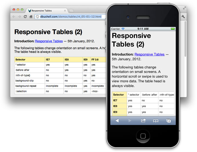
A few smart folks have already put together their thoughts on responsive tables and, while I think the proposed methods are pretty good, I think there might be room for improvement. As such, I’ve been tinkering for a while and came up with the following strategy when it comes to tables.
This is designed to turn tables into rows, for easy mobile viewing
JQuery:
/*Mark TDs as empty if they have no text or img*/
$('table td').each(function(){
    if ($(this).text().trim().length < 1 && $(this).find('img').length < 1){
        $(this).addClass('empty-td');
    }
});
/*Add Attribute to each TD in table*/
$('table').each(function () {
    var table = $(this);
    if ($(this).find('th').length > 1) {
        $(this).find('tr').first().children().each(function (index) {
            //console.log($(this).text());
            $(this).addClass('hide-table-header');
            table.find('td:nth-of-type(' + (index + 1) + ')').attr('header-title', $(this).text());
        });
    } else {
        table.addClass('no-table-header');
    }
});


CSS:
@media only screen and (max-width: 992px),(min-device-width: 768px) and (max-device-width: 1024px)  {
    /* Force table to not be like tables anymore */
    table, thead, tbody, td, th, tr {
        display: block;
    }
    table td:empty,
    table th,
    table thead,
    table .empty-td,
    table .hide-table-header{
        display:none;
    }

    tr {
        border: 1px solid #ccc;
    }

    td {
        border: none;
        border-bottom: 1px solid #eee;
        position: relative;
        padding-left: 50% !important;
    }

    td:before {
        content: attr(header-title);
        position: absolute;
        top: 0;
        left: 0;
        height: 100%;
        /* Top/left values mimic padding */
        width: 45%;
        /*white-space: nowrap;*/
        background:grey;
        padding-top:inherit;
        padding-right:inherit;
        padding-bottom:inherit;
        padding-left:5%;
    }


    table.badtable td:before{
       content: normal;
    }
}
--------------------------------------------------------------------
Edit: This have been redesigned into using Floats instead of position:absolute, and support for colspan and rowspan but it's less plugin-and-play than version #1.
Version 2 below:
JS:
	    /*Start Fill out rowspans and colspans so that nth-child works properly.*/
	    $('td[rowspan]').each(function(index){
	        var startingRowNumber = $(this).parent('tr').index();
	        var number = $(this).attr('rowspan');
	        if (number > 0){
		    for (i = 1; i < number; i++) {
	    	        var clone = $(this).clone(true);
	    	        clone.addClass('responsive-table-styled-hide-in-desktop');
		        $(this).parent('tr').parent().children('tr').eq(startingRowNumber + i).children('td:nth-of-type(' + (index + 1) + ')').before(clone);
		    }
	        }
	    });
	    $('td[colspan]').each(function(){
	        var number = $(this).attr('colspan');
	        if (number > 0){
		    for (i = 1; i < number; i++) {
		        $(this).before('');
		    }
	        }
	    });
	    /*End Fill out rowspans and colspans so that nth-child works properly.*/

	    /*Start Hide unnecessary sections in mobile.*/
	    $('table td').each(function () {
	        if ($(this).text().trim().length < 1 && $(this).find('img,input').length < 1) {
		    $(this).addClass('empty-td');
	        }
	    });
	    /*End Hide unnecessary sections in mobile.*/

        /*Start Add attribute "header-title" to each TD in table*/
        $('table').each(function () {
            var table = $(this);
            if (table.find('th').length > 1 && table.find('table').length === 0) {
                table.addClass('responsive-table-styled');
                var headerRow = table.find('tr').first();
                /*Start multi-row s*/
                if (headerRow.next().length > 0 && headerRow.next().children('td').length == 0) {
                    var firstTextRow = table.find('td').first().parent();
                    headerRow.nextUntil(firstTextRow).addClass('hide-table-header').children('th').each(function () {
                        var text = $(this).text().trim();
                        var index = $(this).index();
                        if (text.length > 0) {
                            headerRow.find('td,th').eq(index).append(' (' + text + ') ');
                        }
                    });
                }
                /*End multi-row s*/
                headerRow.children().each(function (index) {
                    $(this).addClass('hide-table-header');
                    var title = $(this).text().trim();
                    if (title.length > 0) {
                        table.find('td:nth-of-type(' + (index + 1) + ')').attr('header-title', title);
                    }
                });
            } else {
                table.addClass('no-table-header');
            }
        });
        /*End Add attribute "header-title" to each TD in table*/
CSS:
                /*Start Table code*/
        		@media (min-width:1200px){
        		    .responsive-table-styled-hide-in-desktop {
        		        display: none !important;
        		    }
        		}
                @media (max-width:1119px){
                    table, thead, tbody, td, th, tr {
                        display: block;
                    }
                    td:empty,
                    /* th, */
                    thead,
                    .empty-td,
                    .hide-table-header {
                        display: none;
                    }
                    table.responsive-table-styled{
                        border:none;
                        background:none;
                    }
                    .responsive-table-styled tr {
                        border: 1px solid #7F7F7F;
                        margin-bottom:30px;
                        background-color:#E9EDF4;
                    }

                    .responsive-table-styled td{
                        /* position: relative; */
                        border-top: none;
                        border-left: none;
                        border-right: none;
                        border-bottom: 1px solid #7F7F7F;
                        width:100%;
                        box-shadow: 0 0 1px 0 rgba(0,0,0,0.2);
                        height: auto;
                        padding:10px;
                    }
                    .responsive-table-styled td[header-title]{
                        padding-left: 50% !important;/*Make space for the floating element, and force this column to be 50%.*/
                    }

                    .responsive-table-styled td[header-title]:before {
                        content: attr(header-title);
                        padding-right: 10px;
                        background: #F6AD76;
                        color: white;
                        font-weight: 700;

                        /* position: absolute; */
                        /* top: 0; */
                        /* left: 0; */
                        /* height: 100%; */
                        /* width: 45%; */
                        float: left;
                        padding-top: inherit;
                        padding-right: inherit;
                        padding-bottom: inherit;
                        padding-left: 5%;
                        margin-top: -10px;/*size of padding*/
                        margin-bottom: -10px;/*size of padding*/
                        /*margin-left: -10px;*//*size of padding*/
			            margin-left: calc( -10px - 100%);/*100% = 50% of parent*/
    			        width: 100%;/*100% = 50% of parent*/
                    }
                    .responsive-table-styled td[header-title]:after{ /*float clearfix*/
                        content: "";
                        clear: both;
                        display: table;
                    }
                }
                /*End Table code*/
Version 3: Flexbox edition! This has trouble with multiple children inside the TD. Therefore, it wraps any that have children with a div. This is much more invasive, but should be okay in 99% of cases.
JS:
        /*Start Responsive Tables*/
        /*Start Fill out rowspans and colspans so that nth-child works properly.*/
        $('td[rowspan]').each(function (index) {
            var startingRowNumber = $(this).parent('tr').index();
            var number = $(this).attr('rowspan');
            if (number > 0) {
                for (i = 1; i < number; i++) {
                    var clone = $(this).clone(true);
                    clone.addClass('responsive-table-styled-hide-in-desktop');
                    $(this).parent('tr').parent().children('tr').eq(startingRowNumber + i).children('td:nth-of-type(' + (index + 1) + ')').before(clone);
                }
            }
        });
        $('td[colspan]').each(function () {
            var number = $(this).attr('colspan');
            if (number > 0) {
                for (i = 1; i < number; i++) {
                    $(this).before('');
                }
            }
        });
        /*End Fill out rowspans and colspans so that nth-child works properly.*/

        /*Start Hide unnecessary sections in mobile.*/
        $('table td').each(function () {
            if ($(this).text().trim().length < 1 && $(this).find('img,input').length < 1) {
                $(this).addClass('empty-td');
            }
        });
        /*End Hide unnecessary sections in mobile.*/

        /*Start Add attribute "header-title" to each TD in table*/
        $('table').each(function () {
            var table = $(this);
            if (table.find('th').length > 1 && table.find('table').length === 0) {
                table.addClass('responsive-table-styled');
                var headerRow = table.find('tr').first();
                /*Start multi-row s*/
                if (headerRow.next().length > 0 && headerRow.next().children('td').length == 0) {
                    var firstTextRow = table.find('td').first().parent();
                    headerRow.nextUntil(firstTextRow).addClass('hide-table-header').children('th').each(function () {
                        var text = $(this).text().trim();
                        var index = $(this).index();
                        if (text.length > 0) {
                            headerRow.find('td,th').eq(index).append(' (' + text + ') ');
                        }
                    });
                }
                /*End multi-row s*/
                headerRow.children().each(function (index) {
                    $(this).addClass('hide-table-header');
                    var title = $(this).text().trim();
                    if (title.length > 0) {
                        table.find('td:nth-of-type(' + (index + 1) + ')').each(function () {
                            $(this).attr('header-title', title);
                            if ($(this).contents().filter(function () {
                                return this.nodeType === 3;
                            }).text().trim().length < 1) {
                                $(this).children().wrapAll("<div class='responsive-table-inserted-div' />");
                            }
                        });
                    }
                });
            } else {
                table.addClass('no-table-header');
            }
        });
        /*End Add attribute "header-title" to each TD in table*/
        /*End Responsive Tables*/
CSS:
      /*Start Table code*/
        		@media (min-width:1200px){
        		    .responsive-table-styled-hide-in-desktop {
        		        display: none !important;
        		    }
        		}
                @media (max-width:1119px){
                    table.responsive-table-styled,
                    .responsive-table-styled thead,
                    .responsive-table-styled tbody,
                    .responsive-table-styled td,
                    .responsive-table-styled th,
                    .responsive-table-styled tr {
                        display: block;
                    }
                    .responsive-table-styled td:empty,
                    .responsive-table-styled .empty-td,
                    .responsive-table-styled .hide-table-header {
                        display: none;
                    }
                    table.responsive-table-styled{
                        border:none;
                        background:none;
                        word-break:break-word;
                    }
                    .responsive-table-styled tr {
                        border: 1px solid #7F7F7F;
                        margin-bottom:30px;
                        background-color:#E9EDF4;
                    }

                    .responsive-table-styled td{
                        /* position: relative; */
                        border-top: none;
                        border-left: none;
                        border-right: none;
                        border-bottom: 1px solid #7F7F7F;
                        width:100%;
                        box-shadow: 0 0 1px 0 rgba(0,0,0,0.2);
                        height: auto;
                        padding:10px;
                    }
                    .responsive-table-styled td[header-title]{
                        display:flex;
                        direction:rtl;
                    }
                    .responsive-table-styled td[header-title]:before {
                        flex: 0 0 35%;
                        content: attr(header-title);
                        padding-right: 10px;
                        background: #F6AD76;
                        color: white;
                        font-weight: 700;
                        padding-top: inherit;
                        padding-right: inherit;
                        padding-bottom: inherit;
                        padding-left: 3%;
                        margin:-10px -10px -10px 10px; /*10px = padding*/
                    }
                    .responsive-table-styled td[header-title]:after{ /*float clearfix*/
                        content: "";
                        clear: both;
                        display: table;
                    }
                }
                /*End Table code*/

Introduction
In Bootstrap 3, theming was largely driven by variable overrides in LESS, custom CSS, and a separate theme stylesheet that we included in our dist files. With some effort, one could completely redesign the look of Bootstrap 3 without touching the core files. Bootstrap 4 provides a familiar, but slightly different approach.
Now, theming is accomplished by Sass variables, Sass maps, and custom CSS. There’s no more dedicated theme stylesheet; instead, you can enable the built-in theme to add gradients, shadows, and more.
Sass
Utilize our source Sass files to take advantage of variables, maps, mixins, and more.
Setup
Import Bootstrap into a Sass file (for example, application.scss) to get all of Bootstrap's styles, mixins and variables, by copying the following code:
$icon-font-path: "./fonts/bootstrap/";
@import "bootstrap-variables";
@import "bootstrap";
You can also include optional Bootstrap theme:
@import "bootstrap/theme";
Customizing
By default, all of Bootstrap is imported.
You can change which components are imported by commenting out lines in "_bootstrap.scss"
The full list of Bootstrap variables can be found here. You can override these by simply editing the bootstrap-variables.sass file, redefining the variable before the main @import directive.
Note:Bootstrap requires the use of Autoprefixer, for full compatibilty. Autoprefixer adds vendor prefixes to CSS rules using values from Can I Use.
To match upstream Bootstrap's level of browser compatibility, you might want to set Autoprefixer's browsers option to:
[
  "Android 2.3",
  "Android >= 4",
  "Chrome >= 20",
  "Firefox >= 24",
  "Explorer >= 8",
  "iOS >= 6",
  "Opera >= 12",
  "Safari >= 6"
]
Source: https://github.com/twbs/bootstrap-sass
What is Memcached?
According to the official Memcached website, Memcached is a:
“Free and open source, high-performance, distributed memory object caching system, generic in nature, but intended for use in speeding up dynamic web applications by alleviating database load.Memcached is an in-memory key-value store for small chunks of arbitrary data (strings, objects) from results of database calls, API calls, or page rendering.”
In a simple term, Memcached is a distributed temporary object caching system that stores strings and objects in the server’s RAM resulted from processing the database queries, API calls or page rendering. The servers used for this mechanism can be called as Memcached servers.
How to install?
- Install Memcache or Memcached on the machine.
- In wp-config.php add this line: define(‘WP_CACHE’, true);
- Install this plugin: https://wordpress.org/plugins/wp-ffpc/ or https://wordpress.org/plugins/w3-total-cache/
- Configure the plugin settings as the instructions
- Smile and lean back :)
To check all changes to files since, for example, Monday, you can do this:
git log
followed by
git diff --name-status b2c8b3d88dfd5439165f37f41d789f2239b34a6b
Before doing a GIT PULL, to check which files will be changed, type this: (Note: This ignores local modifications unless they won't be automatically merged, which is good for stuff like .htaccess)
git fetch && git diff HEAD @{u} --name-status
If you want to see ALL changes including uncommited local modifications, do this instead (This is more useful for a planned GIT RESET than a GIT PULL):
git fetch && git diff @{u} --name-status
To see all changes to a single file, simply do this:
git log path/to/file
If you want to revert a single file to a previous version, do this: (Note: Running this will cause you to have uncommited local modifications, which will cause a merge conflict the next time you GIT PULL. Before GIT PULLING, you'll need to restore this file to the latest version.)
git checkout commitID path/to/file
If you're in middle of a merge conflict, and want to discard your local changes to a single file, you can use this:
git checkout --theirs path/to/file
If you want to modify your previous commit instead of creating a new commit, you can use this:
Note: You should not do this after you have already GIT PUSHED! If you try this, then it will cause MAJOR problems!
git add path/to/file
git commit --amend

SCSS tips and tricks
Some things in CSS are a bit tedious to write, especially with CSS3 and the many vendor prefixes that exist. A mixin lets you make groups of CSS declarations that you want to reuse throughout your site. You can even pass in values to make your mixin more flexible. A good use of a mixin is for vendor prefixes. Here's an example for transform.
@function ConvertToREM($pxval) {
    $unit: unit($pxval);
    @if $unit == "px" {
        $val: parseInt($pxval);
        @return #{$val / $baseFontSize}rem;
    } @else {
        @return #{$pxval / $baseFontSize}rem;
    }
}
/*This mixin creates input Placeholder CSS. Example: */
/*@include placeholder {
    color: white;
    font-weight:100;
}*/
@mixin placeholder {
  &::-webkit-input-placeholder {@content}
  &::-moz-placeholder          {@content}
  &:-ms-input-placeholder      {@content}
  &::placeholder               {@content}
}


@mixin clearfix() {
    &:before,
    &:after {
        content: "";
        display: table;
        clear: both;
    }
}

/*This duplicates Bootstrap 4's .container class.*/
@mixin container(){
  width: 100%;
  padding-right: 15px;
  padding-left: 15px;
  margin-right: auto;
  margin-left: auto;
  @media (min-width: 576px) {
    max-width: 540px;
  }
  @media (min-width: 768px){
    max-width: 720px;
  }
  @media (min-width: 992px) {
    max-width: 960px;
  }
  @media (min-width: 1200px){
    max-width: 1140px;
  }
}

/*This mixin uses math to help calculate colors with opacity.*/
/*Use it as follows:  background: alphaize(#73d6ff, #a0def5,0);*/
@function alphaize($desired-color, $background-color, $minimum-alpha: 0) {

    $r1: red($background-color);
    $g1: green($background-color);
    $b1: blue($background-color);

    $r2: red($desired-color);
    $g2: green($desired-color);
    $b2: blue($desired-color);

    $alpha: 0;
    $r: -1;
    $g: -1;
    $b: -1;

    @while $alpha < 1 and ($r < 0 or $g < 0 or $b < 0
    or $r > 255 or $g > 255 or $b > 255 or $alpha < $minimum-alpha) {
        $alpha: $alpha + 1/256;
        $inv: 1 / $alpha;
        $r: $r2 * $inv + $r1 * (1 - $inv);
        $g: $g2 * $inv + $g1 * (1 - $inv);
        $b: $b2 * $inv + $b1 * (1 - $inv);
    }

    @return rgba($r, $g, $b, $alpha);
}